NoBS Women
Empowering Coaches with a scalable custom platform
NoBS WeightLoss is a multi-million-dollar membership platform with over 14,000 paid members worldwide.

NoBS Story & My Mission
Corinne Crabtree, the founder of NoBS WeightLoss, created the program after her own 100-pound weight loss journey, focusing on mindset transformation. The program's rapid growth from a basic WordPress site led to significant scalability challenges. To better serve its large community and coaching staff (many of whom were former members), the decision was made to migrate to a robust, custom-built platform.
I joined the DockYard team following the initial Minimum Viable Product (MVP) launch. This version featured an Elixir backend to address performance, core coaching functionalities, and a page builder. My mission was to evolve this platform into a high-impact, user-centric product.

The MVP version of the NoBS custom coaching platform
Designing for Real People
The platform served two distinct user groups: Admins (Coaches) and Weightloss Members. To gain genuine insight, I established weekly feedback meetings with coaches and adopted a deep immersion strategy: I role-played as both an Admin and a Member using dedicated accounts and joined live member calls to observe user behaviors, concerns, and personalities firsthand.
This immersion revealed that the core member community primarily consisted of women aged 40–70 who were often not tech-savvy. This finding underscored the critical need for a supportive, simple, and highly intuitive platform, a principle that became the foundation of my design approach
Driving the Design Strategy
I clearly defined my responsibilities across several categories: identifying pain points, defining core problems, creating Jira tickets, and setting design backlog priorities. This process required continuous, cross-functional collaboration:
-
Coaches: As key stakeholders providing invaluable insight into daily user needs.
-
Product Manager: To ensure effective time management and roadmap alignment.
-
Engineers: To accurately assess technical feasibility and effort.
Our prioritization model centered on delivering Low-Effort, High-Impact results.
Driving Efficiency with a Refined Design System
My core principle was developing and utilizing reusable components to ensure efficiency and consistency across both design and development. I significantly improved the existing Design System by:
-
Introducing new feature components (e.g., accordions, lists, and cards).
-
Redesigning member and marketing interfaces for enhanced accessibility and visual coherence.


Universal components, such as cards and lists, were redesigned for improved consistency and development efficiency.
Streamlining Admin Workflows
A key objective was to enhance features and optimize administrative workflows to speed up content creation and enable a more personalized member support experience. This involved significant improvements to core tools.

Admin Platform Additions & Tools


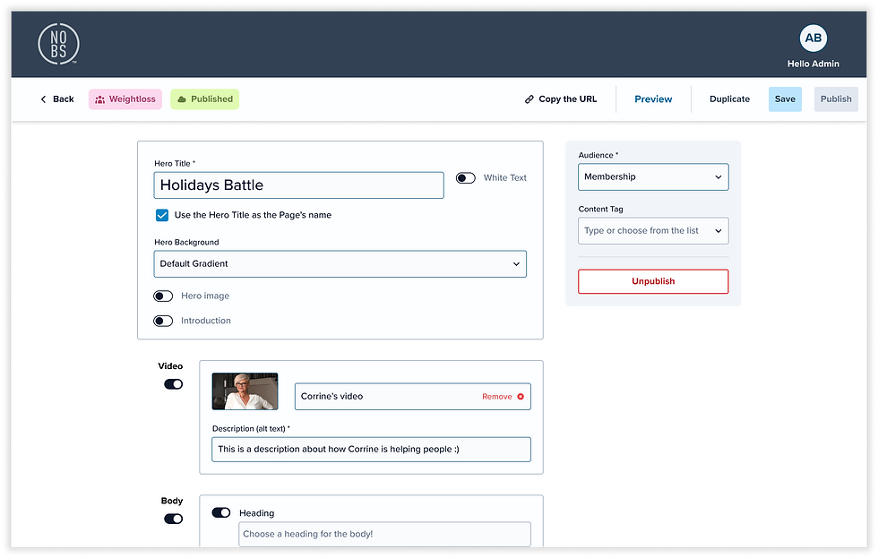
Example of usability improvements implemented to streamline coach workflows.
Relocated key functions and simplified the metadata sidebar for enhanced clarity, standardization, and accessibility through improved navigation and status indicators.
Driving Member Retention Through Personalized UX
Recognizing that retention was the most critical metric for the monthly subscription model, I focused my efforts on reducing churn, achieving a significant 27% increase in membership retention over an eight-month period.
My journey began by uncovering the root causes of member cancellations through a three-pronged investigation:
-
Data Analysis (Airtable + Stripe Integration): Analyzing membership and cancellation data to identify behavioral patterns and the typical timing of churn.
-
Exit Questionnaire: Implementing a short form displayed just before cancellation to capture real-time feedback on the specific reasons for leaving.
-
Collaboration with Coaches: Conducting brainstorming sessions and reviewing Q&A discussions to pinpoint recurring member frustrations.
Key Findings
-
Approximately 65% of cancellations occurred within the first three months of membership.
-
Members struggled to find specific content mentioned during live sessions, indicating significant navigation challenges and poor content discoverability.
-
The lack of content hierarchy and a clear learning pathway left many members feeling confused, overwhelmed, and discouraged.
Ideate & Implement Solutions
I visualized solutions through wireframes, validating feasibility with the DockYard engineering team and reviewing concepts with coaches. Initiatives were prioritized based on achieving maximum impact with minimum effort.
Enhanced Search for Targeted Content Discovery
To address discoverability, I implemented a solution that clearly displays search results across all content types (Replays, Q&A, Resources, Pages). Users could easily narrow down results using filters. Furthermore, we developed a Tag Manager to allow admins to efficiently create, manage, and assign new content tags, ensuring long-term content organization.


Enhanced search results displaying content categorized by type for easier discovery
Improving Content Discoverability through Information Architecture (IA) Redesign
I redesigned the main navigation and improved the platform’s IA. This resulted in more intuitive data categorization and content organization. Crucially, by integrating familiar terminology used by coaches during live calls, members could more efficiently locate necessary resources.
To tackle the 65% early churn rate, I introduced the "Membership Happy Path." This guided onboarding experience, developed with coaches, gradually delivered essential steps to reduce initial overwhelm and boost motivation. We created a new Audience Group to scope down the content shown on the homepage and simplify the Navigation Manager for members in their first 30 days, ensuring a highly focused and successful start.


Image one: Initial Member Landing
Image two: First-30-Day 'Onboarding' Member Experience
Image Three: Established Member Home and Navigation (30+ Days)
Solving Content Overwhelm with a Course Builder (LMS)
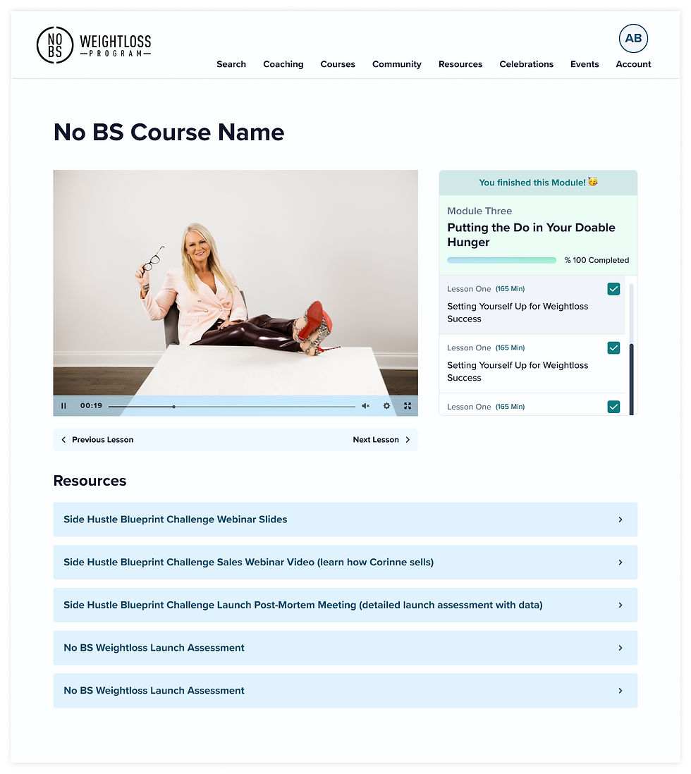
My long-term solution to content overwhelm was the design and implementation of a Learning Management System (LMS) utilizing existing components. This system empowered Admins to structure related content (videos, PDFs, pages) into guided courses based on topic or membership duration. This design eliminated the confusion caused by thousands of scattered resources, providing members with a straightforward, progressive path that effectively boosted their focus and sustained motivation by highlighting their ongoing progress.


Course Builder UI mockups, utilizing existing components. Shows structure for Modules and Lessons.
Focus on Collaboration and Process
I established a close cross-functional partnership that drove design from conceptualization through to final delivery. My process was characterized by transparency and continuous feedback:
-
Design Validation and Review: Initial concepts were visualized using wireframes or low-fidelity prototypes for weekly design reviews. This ensured early alignment with engineering on the design strategy, roadmap, and technical feasibility.
-
Proactive Problem-Solving: Leveraging the engineering team’s technical knowledge for effort estimation allowed us to identify and resolve complexities together, often leading to simpler, more efficient solutions and effective management of technical debt.
-
Hand-off and QA: Final designs, including prototypes and user flows, were meticulously attached to relevant Jira tickets. We conducted thorough Quality Assurance (QA) on every ticket before final completion to ensure design fidelity in production.


Course Publish Flowchart